Wednesday 27 May 2015

VANESSA RUSSELL- CHARACTER AS A BRAND


Brand Analyse


More information about the Brand and the flavours.


As Nelson is my home town below is some of the images and stereotypes that go with Upper Moutere and the people. People from Upper Moutere are seen as big farming and rural families and along with that comes many jokes and stereotypes surrounding rural hippies and hillbillies.


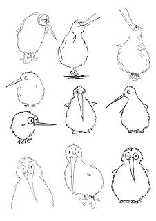
Apart of Old Mout's brand they often use a black kiwi to show its New Zealand roots and homegrown feel. Below are images that show different ways or turning the kiwi into cartoons.

For my character I have decided to further use the kiwi but put a Upper Moutere spin on it to show the brands Country/rural roots and ways of life.
Below are some simple sketches of form and pose of my initial kiwi design.


Because the design of the Kiwi is so common into New Zealand the clothing that I will add to it will make it distinctive and therefore recognisable as Old Mout Cider's mascot.


I went with a typical rural look for my mascot as it conveys the brands theme and values,
For further development I  may add the OLD MOUT logo to the singlet to make it even more identifiable. 

Final Clothing

Finals


Rationale


Friday 13 March 2015

Precedent Example 4


Precedent Example 4


Vodafone Building by Barbosa & GuimarĂ£es in Oporto, Portugal

This building plays with the idea of having different angles in a area and light. In my space I think it could be good to show a chaotic mind through many different wall angles and geometric shaped lighting or skylights.  

Precedent Example 3


Precedent Example 3


David Letellier - Kinetic sculpture installation, 2010

This sculpture shows that a installation doesn't have to be on the ground to be effective. I thought that it would show the idea of not being able to sleep if i suspended the bed in the air or a contraption that communicated restlessness above the bed.

Precedent Example 2


Precedent Example 2 


The Italian Pavilion EXPO2010 | Design: Giampaolo Imbrighi, Teresa Crescenzi, Antonello De Bonis, Cosimo Dominelli, Iodicearchitetti (Francesco Iodice, Giuseppe Iodice, Marcello Silvestre)

This design effectively communicates the idea of combining different materials in a space. The geometric design and cut of the wood gives it a clean, polished finish that I am trying to achieve with my design. I find the idea of playing with different materials to be something that can show a restless mind as it is not confined to one "idea" so in this design the space isn't confined to one material.

Monday 9 March 2015

Precedent Example 1


Precedent Example 1


Foam by Kohei Nawa at the Aichi Triennial.

I chose this example as it conveys the idea of calm with its texture and colours. The simple structure of the foam makes it appear to look like clouds therefore having connotations that relate to sleep such as peacefulness. I would like to use elements of this in my room to show the idea of relaxation and comfort instead of having a conventional bed in my design.


1:50 Section and Plan Concept

Drawing Exercises Week 2